The original intentions of the script, the characters’ personalities, the music, video, graphics, the integrity of the code, and now even the typography. Nothing is safe! I’ve been studying and practicing typography lately, so this is a topic dear to my heart.
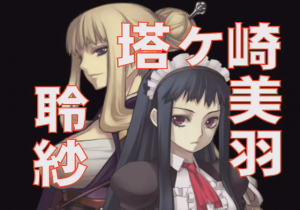
Here’s a frame from the introduction to the game’s parody Cosmosphere:

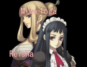
And here’s the same screen from the localization:

Okay, we already knew that names were getting changed, so Tougasaki Miu becomes Miwa Togasaki (this screen capture was taken before the entirety of the name had appeared on screen).
But setting aside the names, the typography is criminal! These frames are presented quickly to introduce the cast of characters in an alternate parody version of the Ar tonelico 2 world. They should be stylish and cool, to get the player into the mood of the alternate world, and they should be readable, to inform the player of these characters’ alter egos in that world.
Instead, the weak, weak monospaced computer typeface chosen is just about the worst possible. It’s not substantial enough to be read quickly (regular weight versus the original’s probably W8), especially with the red border. Its shape is already ugly, but especially so when the borders exaggerate the discrepancy between the weight of different parts of the letterforms, most obviously in the M. It’s monospaced, which is a kind of font that exists for the purposes of reproducing the idiosyncracies of very old computer systems, and has almost no place in graphic design.
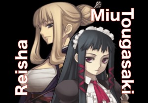
All of the typographical character of the original design is lost. Here’s a version I threw together very quickly; it uses in-game sprites whose resolution isn’t as high as it should be for this job, but the point for now is the typography.


